What makes
a great logo great.
Insights | 4 March 2019

Many times I’ve been involved in conversations about “good and bad” being either objective or subjective. As a designer and branding enthusiast, I want to dive deeper into the topic of what makes a logo good or bad and what benefits or difficulties it might bring to the entity.
To do so we need to understand the purposes and reasons of having a logo, so let’s go back in history to find that out. When was the first logo created and used? Nobody knows, actually, but what we know is that it goes way beyond our understanding of the corporate world. It all started with cave paintings and developed to the point where each tribe had its own emblem, governments and armies had their coat of arms, and religions had their symbols.
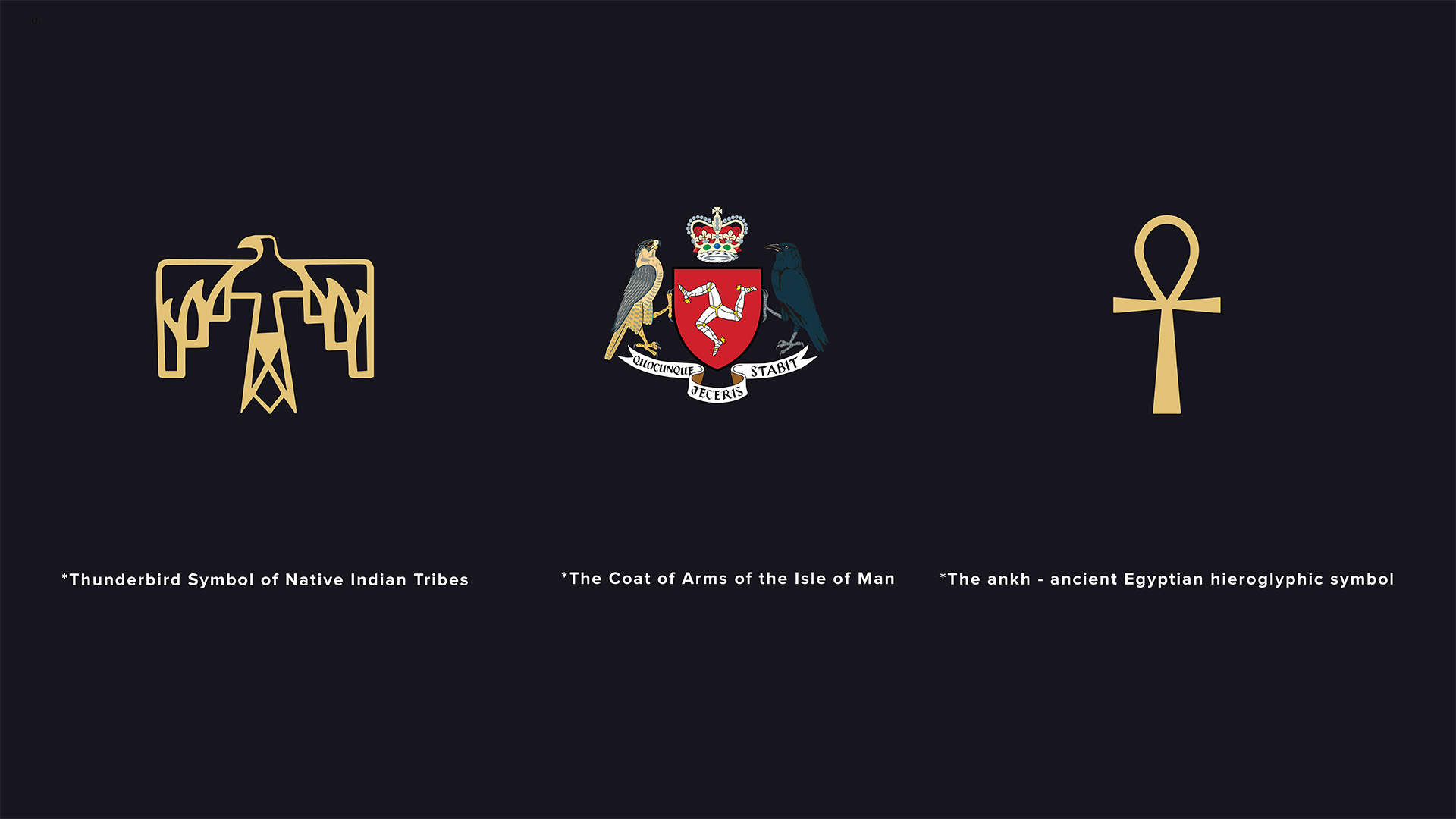
The main reason for these early visual representations was to distinguish fellows in your own tribe from the strangers and enemies. Later on, as societies were evolving, the meaning and ideas behind the symbols were evolving as well. It was a matter of pride and legacy for successful rulers, a matter of belongings and faithfulness for religions, and a matter of braveness and heroism for warriors. As each group had its own distinguished attributes, depending on its location or craft, for example, the symbols and emblems usually were associated with these attributes.
The very same values have carried through history to the corporate world. One of the first corporations was the Dutch East India Company (VOC). It’s often considered the first publicly traded company, so we might assume that its logo as used in today’s terms is the first logo, or at least the first one that “survived” over the years.
Here are a few examples of symbols that were carrying their purposes through the centuries, sometimes even millennia. As such, we might affirm that these symbols are good because they distinguished their owner from others, they are still well known, they show values and beliefs, and even today they are recognized for the activities of their owner.
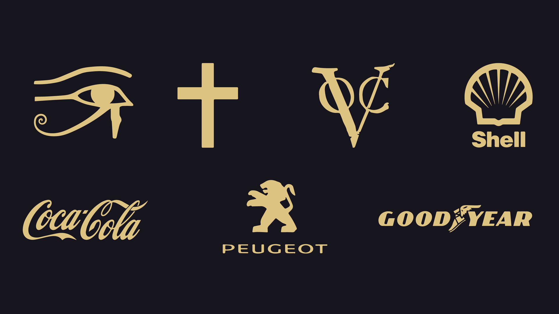
So what makes these logos do their job so well? Without going too much into the details, we can say that they are simple, unique, artistic and obviously timeless.
Now let’s see if this could be the case for modern logos. Here are a few of the most successful, innovative and recognized companies nowadays.
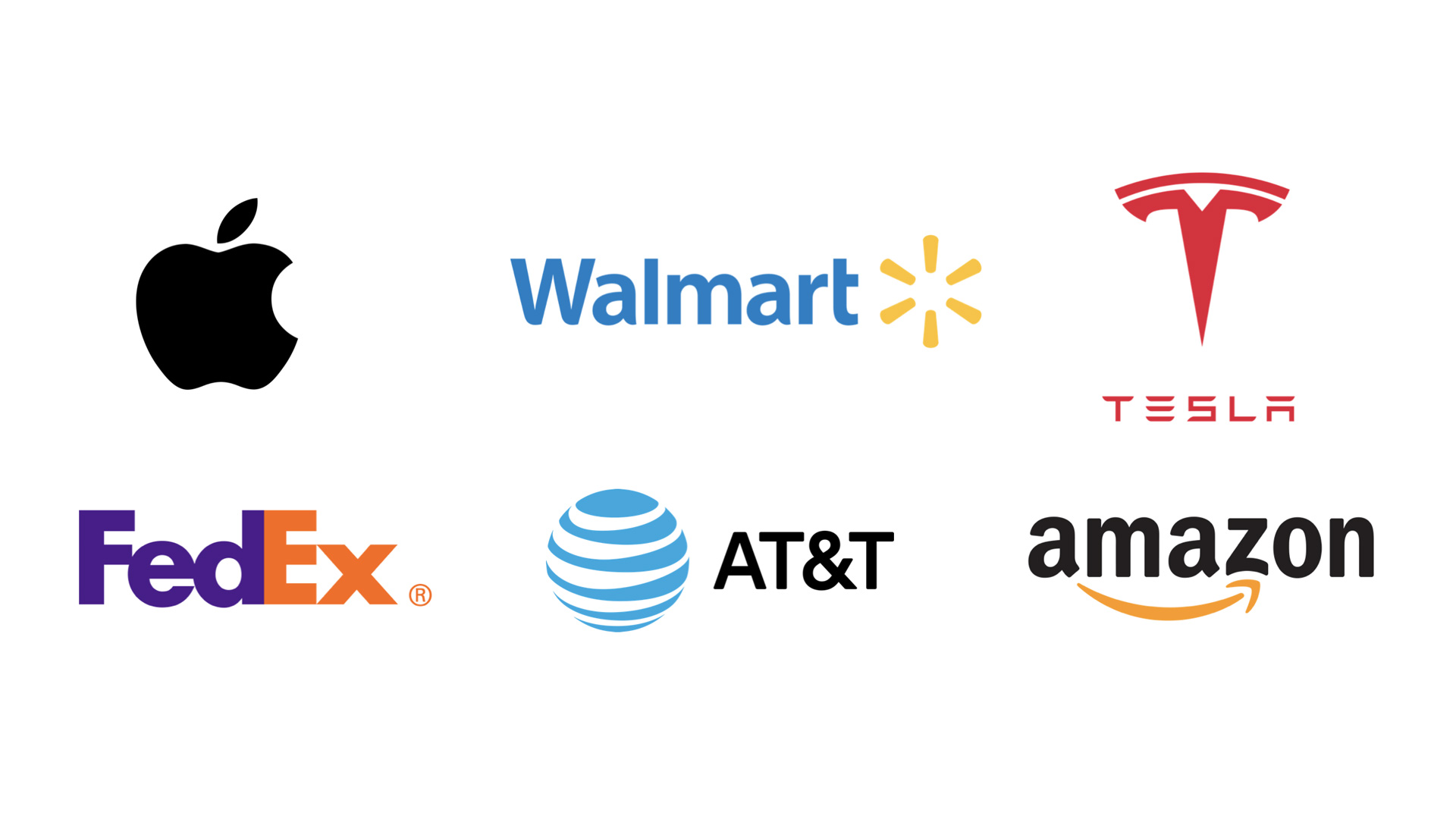
Interestingly, they have many of the same characteristics of the logos of the past. Let’s break them down to figure out how to make a strong logo that will serve any business for a good amount of time and how to make the logo design process easier for a graphic designer. Each of these logos exemplifies four key qualities: they are simple, unique, artistic, and timeless.
SIMPLE
- Uniform – Doesn’t have more than one symbol in one logo. This should be obvious as the logo actually is the symbol, but I’ve seen so many logos that try to include a few symbols, one after another – for example making two or more stylized letters. It makes the logo distracting and draws attention away.
- Mono-color – This allows it to be easily embedded on uniforms, made as a store sign, placed on the product or just be printed black and white on letterhead.
- Scalability – All of these logos can be scaled down to a tiny size and still be recognizable. This allows the brand to show the logo in a variety of places such as corporate stationery, a pencil, the header of the website, a large street sign, and so on.
- Clarity – If the logo is clean and minimal it’s easy to remember, it doesn't distract the eye, and it doesn't feel annoying.
UNIQUE
- Exclusive – If the logo is too similar to the one that already exists, especially if it’s well known, it not only might be considered as plagiarism but also has a very low chance of being well recognized.
- Uncommon – Using common shapes or letters also has a low chance of success, as they might be used in a variety of other places and can be easily confused with another entity.
- Explanatory – This doesn’t mean that every logo should clearly show the subject or the product of a company; if it’s a car company, a logo doesn’t have to be a car or a wheel, and if it’s a food company, a logo doesn’t have to show a carrot or a baguette. But there are many creative ways to show the company's values or industry. (Amazon has an arrow drawn from A to Z showing that they have every book (now every product) from A to Z, FedEx has an arrow showing ultra-fast delivery, Vaio’s logo shows an analog wave as V A and digital technology as I O, and AT&T has a globe showing how they connect the world with their telephone and Internet technologies.)
ARTISTIC
- Grids – A nice and easy practice to make the logo solid and organic-looking is to use a grid. There are a variety of grids to choose from but the oldest one and probably the most powerful is the “golden ratio.” We can find it everywhere: in nature, in ancient architecture and in most famous logos, of course, such as Apple, Twitter, Pepsi, Google, etc.
- Clever – Not every logo has to be clever, but it’s an extra step to makes people say “wow.” It’s a good way to showcase “out of the box” thinking of the designer and the creativity of the company. There are many ways to “go clever” with logo design, such as hidden symbols (Toblerone has a bear inside of the mountain, Tour de France has cyclists among the letters), negative space (FedEx has an arrow between E and X, Formula 1 has 1 between an F and red motion blur) and other creative techniques.
- Balanced – A strong logo should be well balanced in terms of shape and color. Sometimes designers go so deep in their creativity that they forget about the visual appearance of the logo. One element should not offset another, the main color should complement a secondary one, and the whole picture should be appealing to the eye.
TIMELESS
- Out-of-Trend – It isn’t bad to follow the trends. In most cases, designers love trends; trends give us more projects. But trends change frequently, and changing the logo too often is damaging for business. It costs money (especially for net companies who have to replace the interior and exterior of their branches), it affects recognition in a negative way, and it doesn’t really make sense in every other aspect. Every logo designer should ask himself, will this logo be appropriate in 100 years?
- Usable – A logo is meant to be seen. Its core mission and foundation is to go out and represent the entity it was made for. To do so, any logo should be usable in a variety of ways. Can we place the logo in a square or circle for social media? Can we make a front-door sign with this logo? What sort of media could exist in 100 years, and can this logo be placed on that? It’s good practice to design all possible versions of the logo – horizontal, stacked, symbol on its own, etc.
In conclusion, I’d like to say that any rule can be broken. There are good examples, such as W hotel, which uses a red W as their logo (not a very unique symbol) or iikoh.com, which uses a circle (a pretty generic form) or Stella Artois, with their vintage and pretty complex badge logo. But before making a decision to break the rules, make sure it’s a wise and appropriate solution that will benefit the brand and amplify its value.
About author
Michael Cherkashin is an award winning Graphic Designer and Creative Director at HUG Agency, his creations have helped brands such as LA Lakers, Universal Studios, Paramount Studios and others. Michael's collaborations also help innovative startups get their feet off the ground with his exceptional design practice and mindful approach to user experience.


Next
Value-Based
logo design principles
Developed at HUG Value-Based logo design principles is a part of the branding strategy that we use to create meaningful brands.
ExploreDon't miss
upcoming stories
Subscribe
Let’s create
something amazing