Vivino
UI/UX | BRAND IDENTITY | LOGO DESIGN
Based on the app store reviews and focus group we found two major challenges; Vivino is mostly used as a wine scanner with the rest of the functionality being confusing and the cellar is not shareable, which makes it difficult to track wine within the family. Along with fixing these two functional challenges we've worked on improving the overall design to increase desirability and excitement.
Main screens
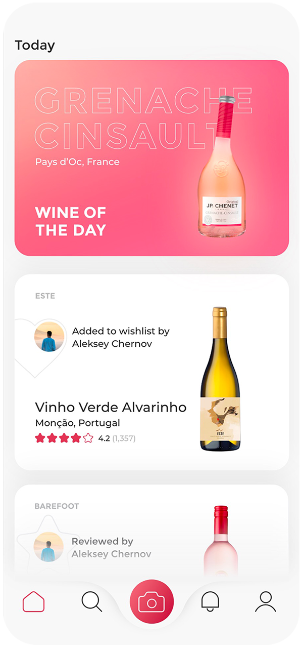
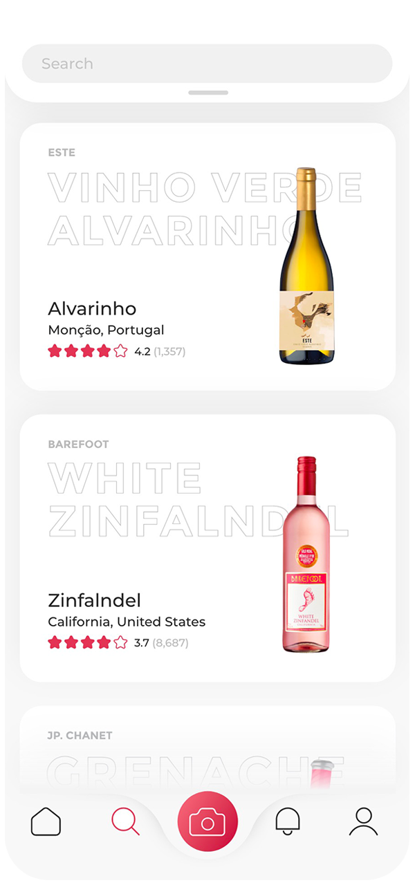
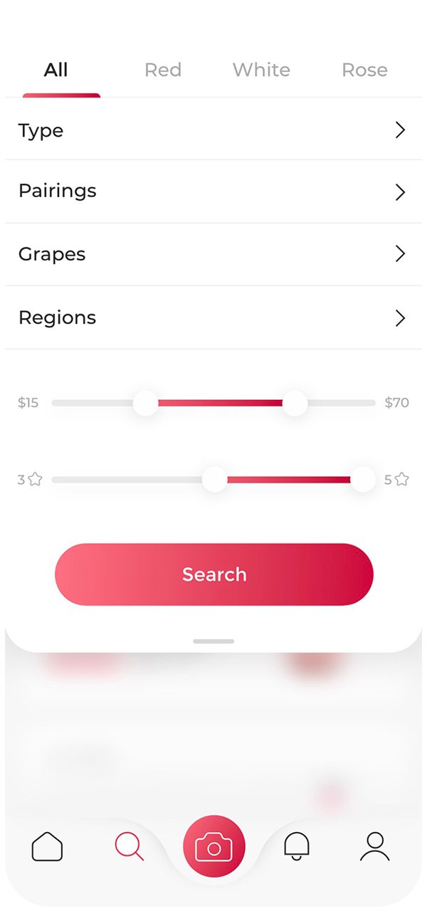
The app gives you recommendations based on your personal taste, suggests expert-picked “Wine of the day” as well as friends activity. On the explore page dragging the top panel shows filter options.
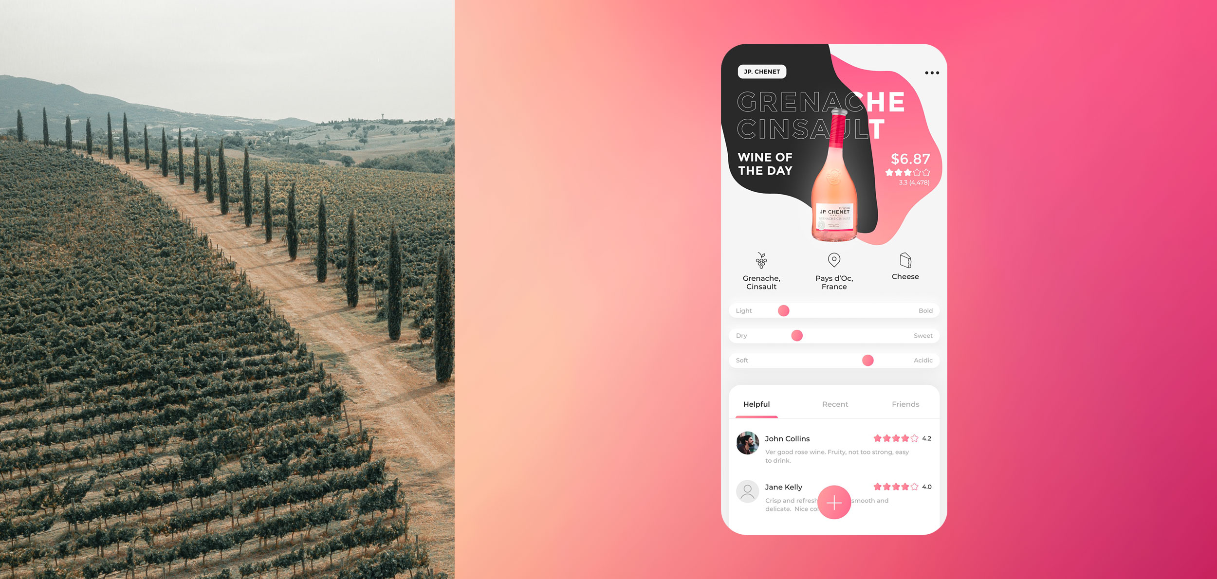
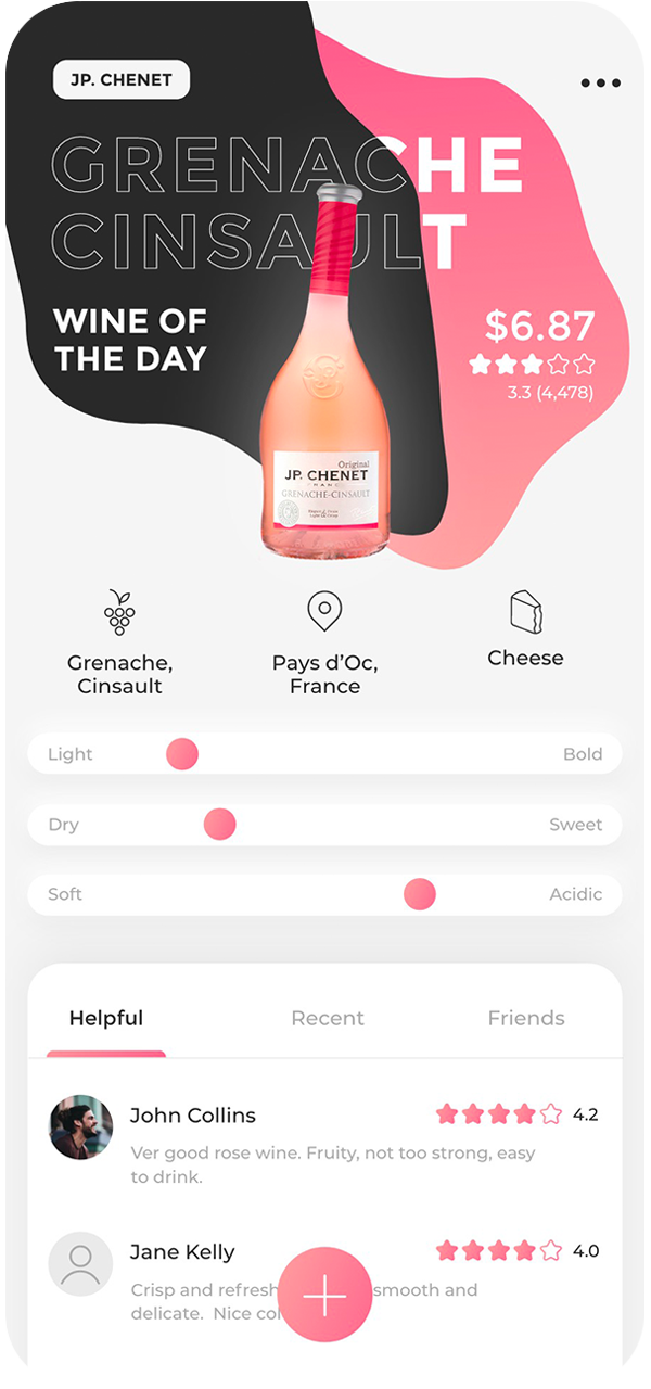
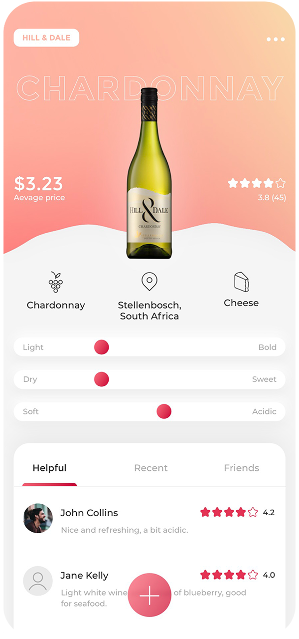
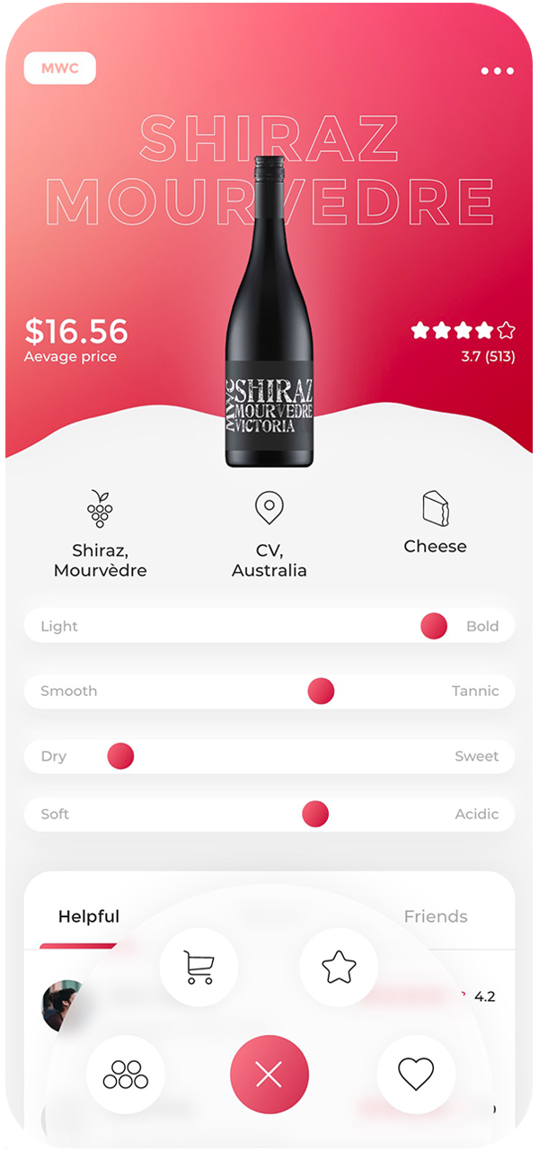
Wine screens
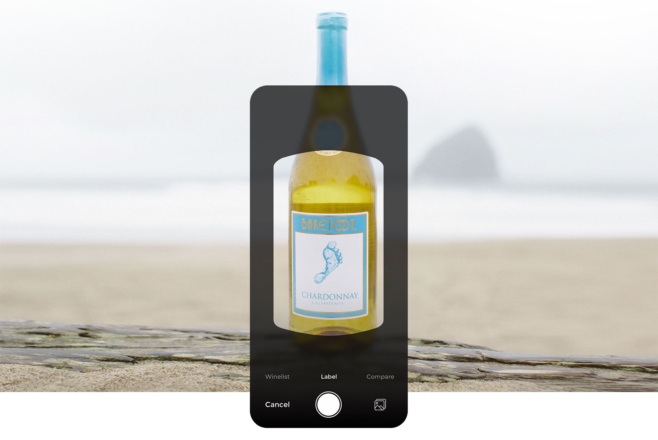
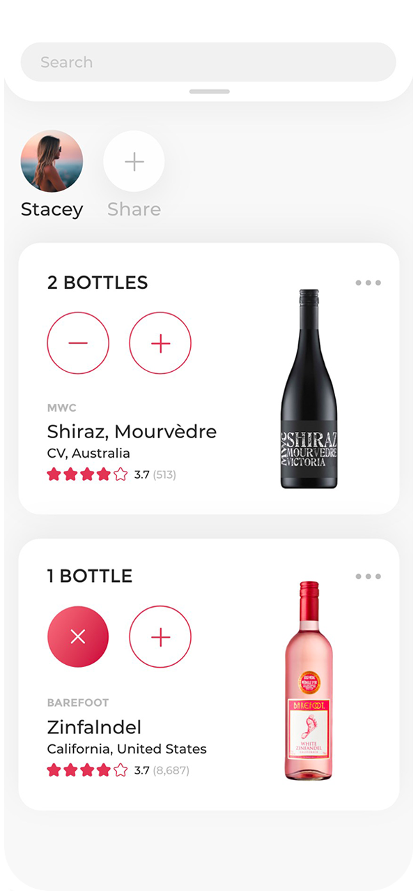
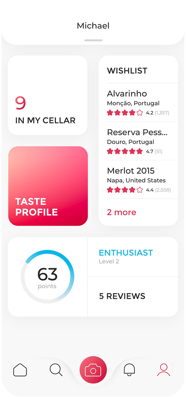
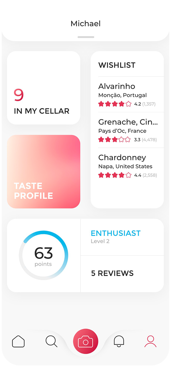
Background changes based on the type of wine (red, white, etc) with wine of the day having a unique design. A floating button expands to provide necessary actions. The cellar represents a digital copy of all your wines. Share functions allowing to have one cellar within a family or group of friends.
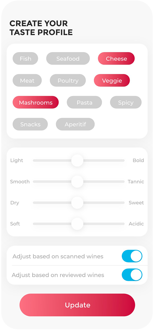
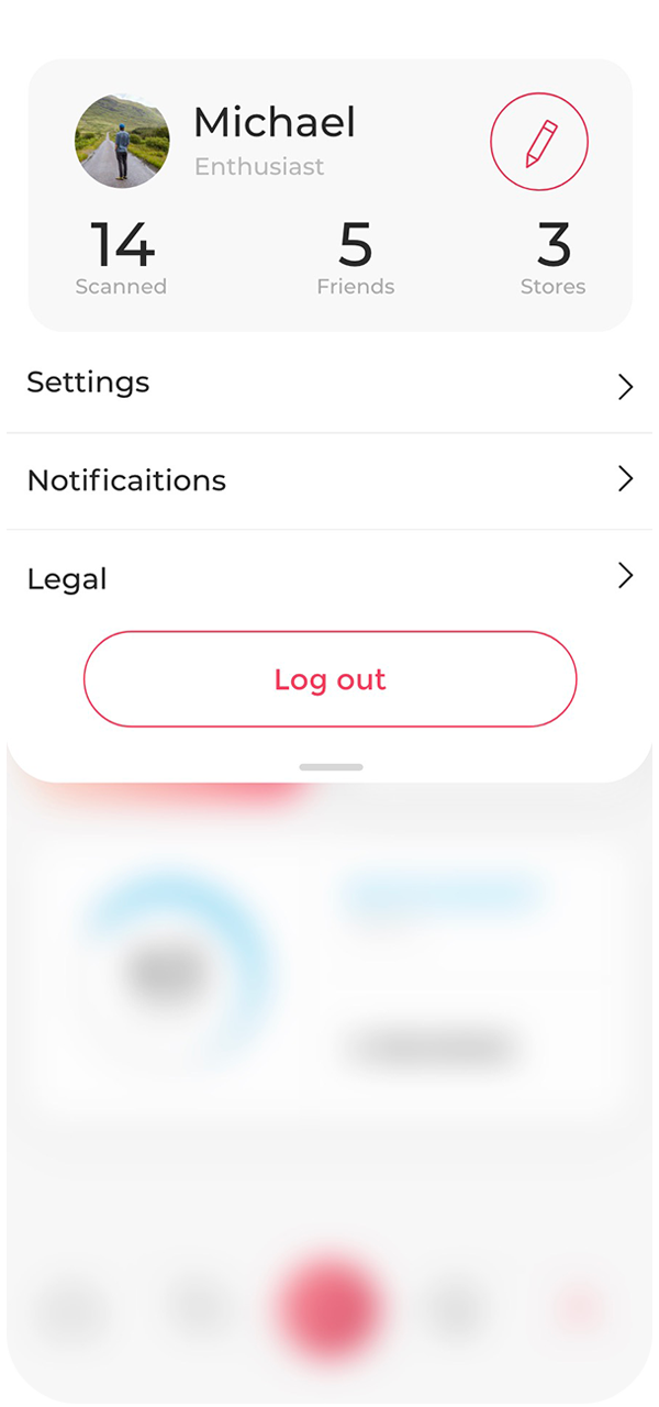
Profile and
settings
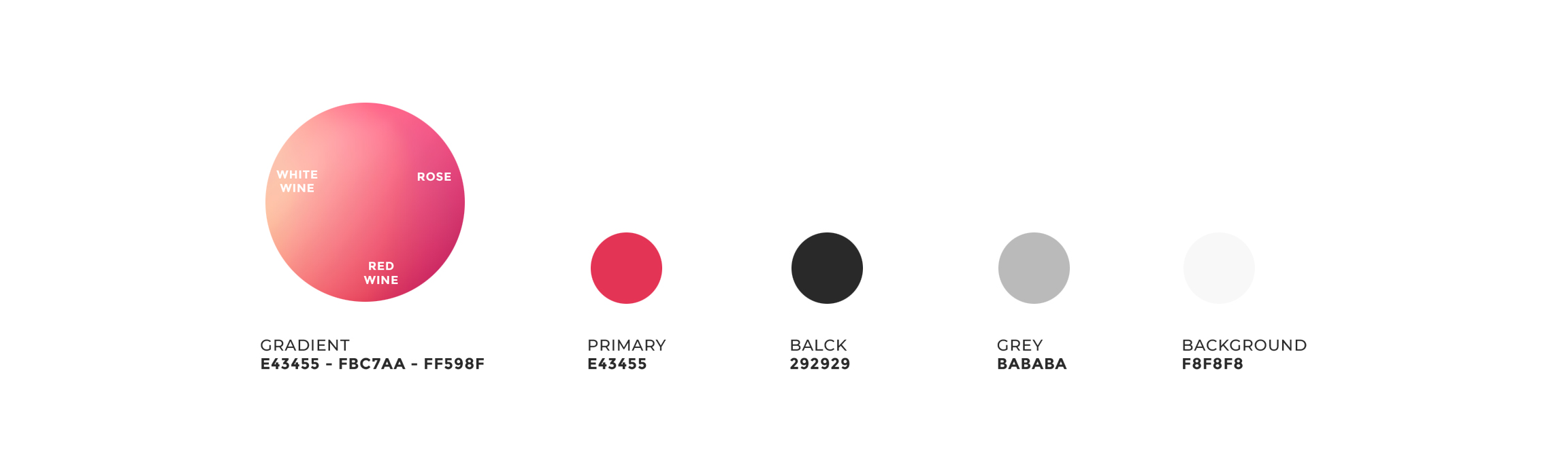
An ability to set your wine preferences allowing recommendations and search function to show wines that you’re most likely to love. With auto-adjust feature the taste profile evolves based on the scanned and reviewed wines and the gradient color is adjusting based on the preferences to red, white or rose.
Let’s create
something amazing