Tesla Model 3
User Experience
UI DESIGN | UX DESIGN | AUTOMOTIVE | HMI
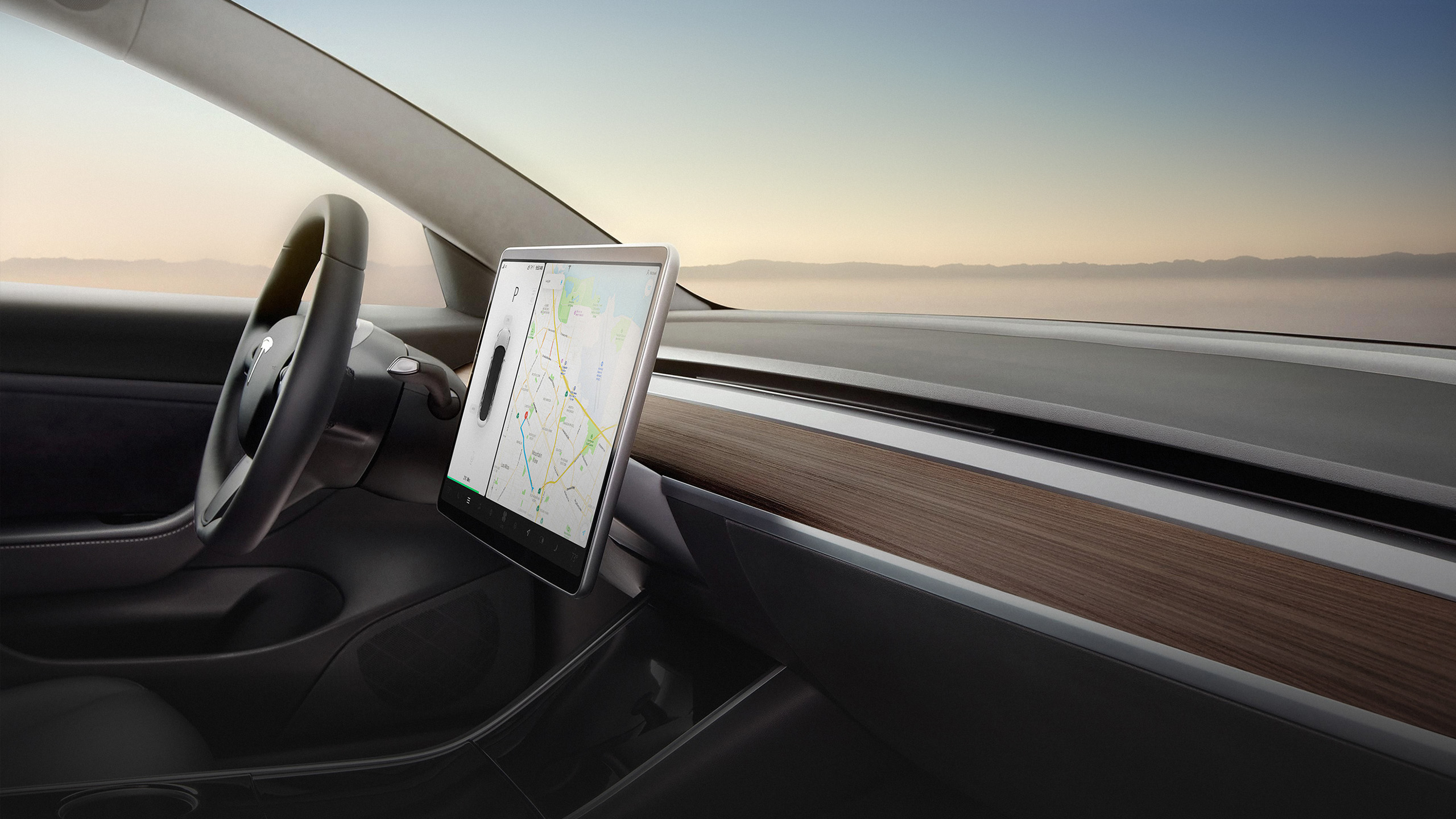
Our vision for any user interface is simple: efficiency should be as close as possible to 100%, in other words, a user should be able to perform the desired task with as little effort and distraction as possible. This would be especially pertinent to vehicles as safety is such a priority.
Tesla MotorsThe grid
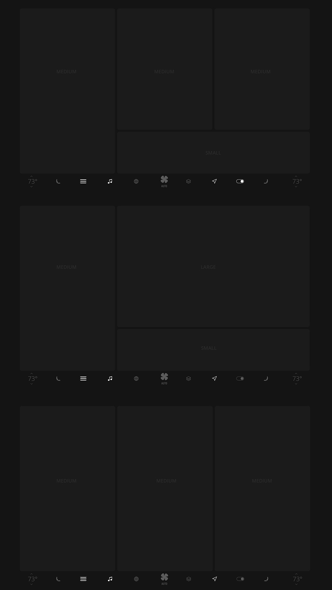
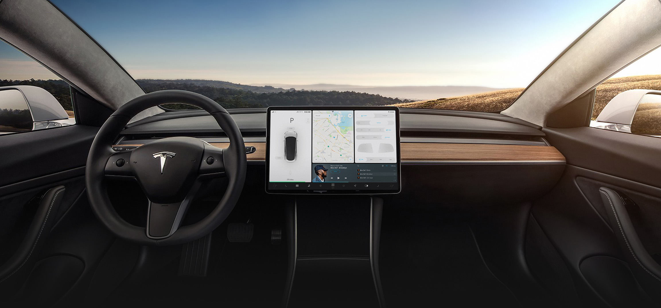
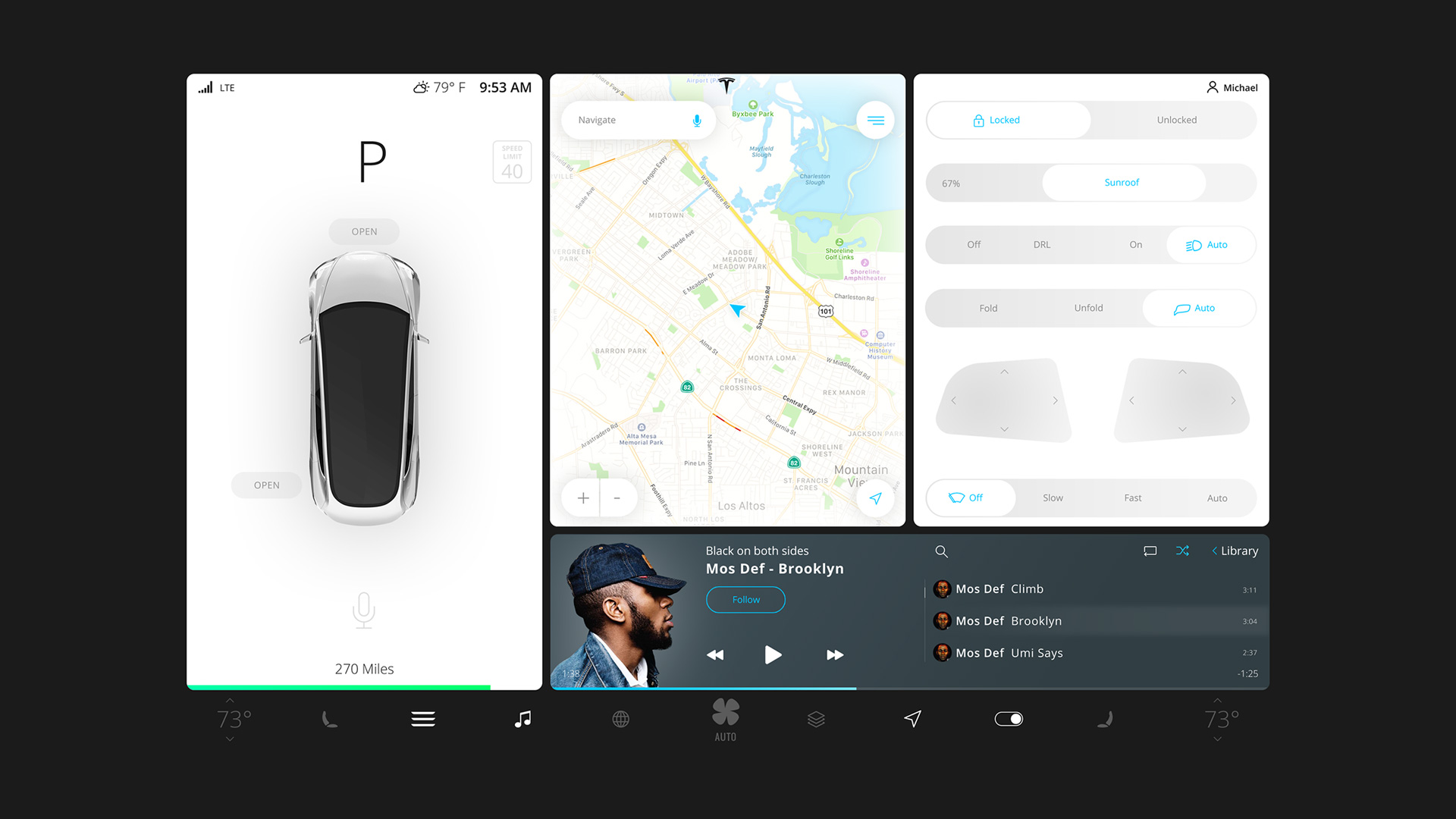
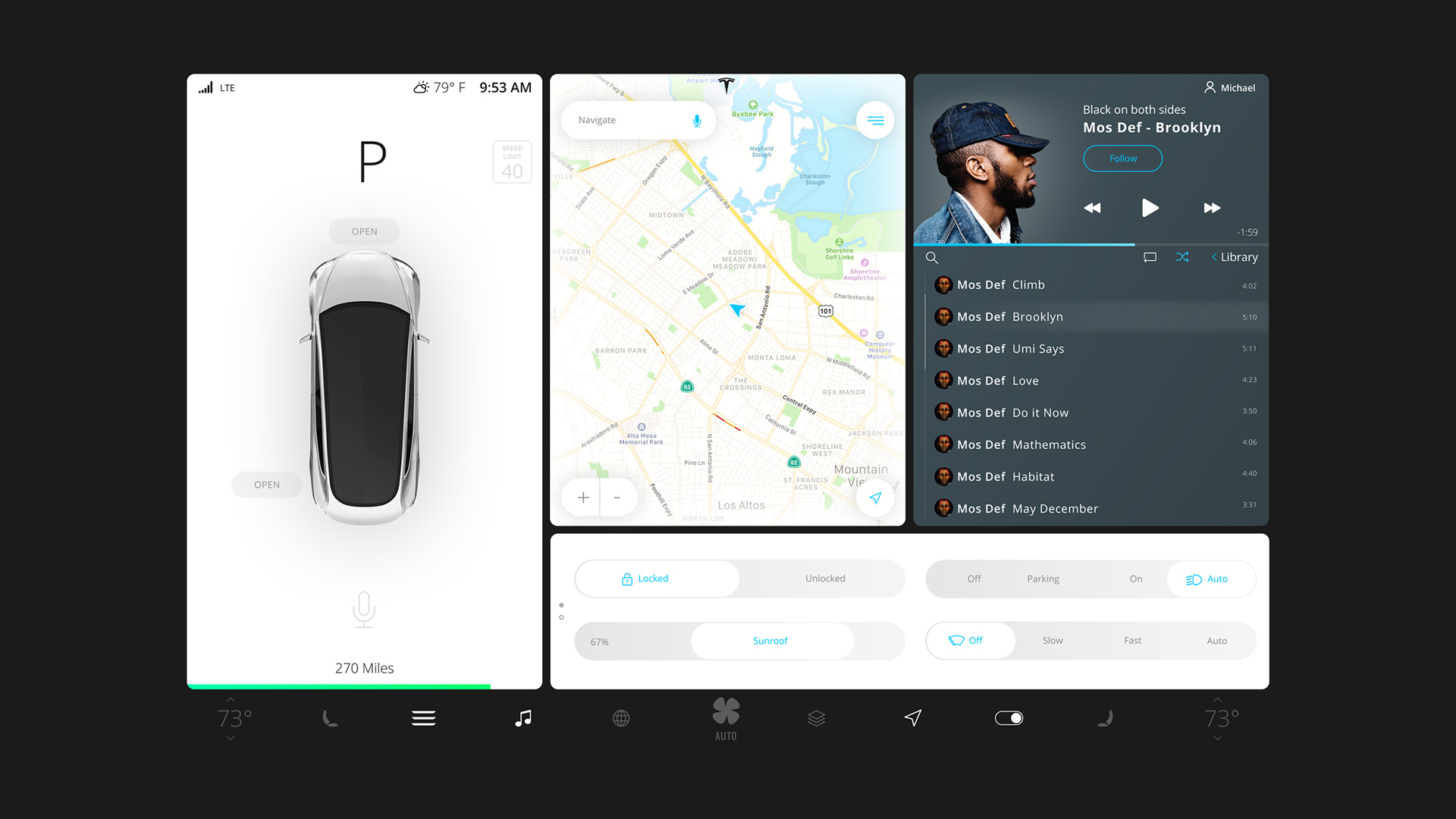
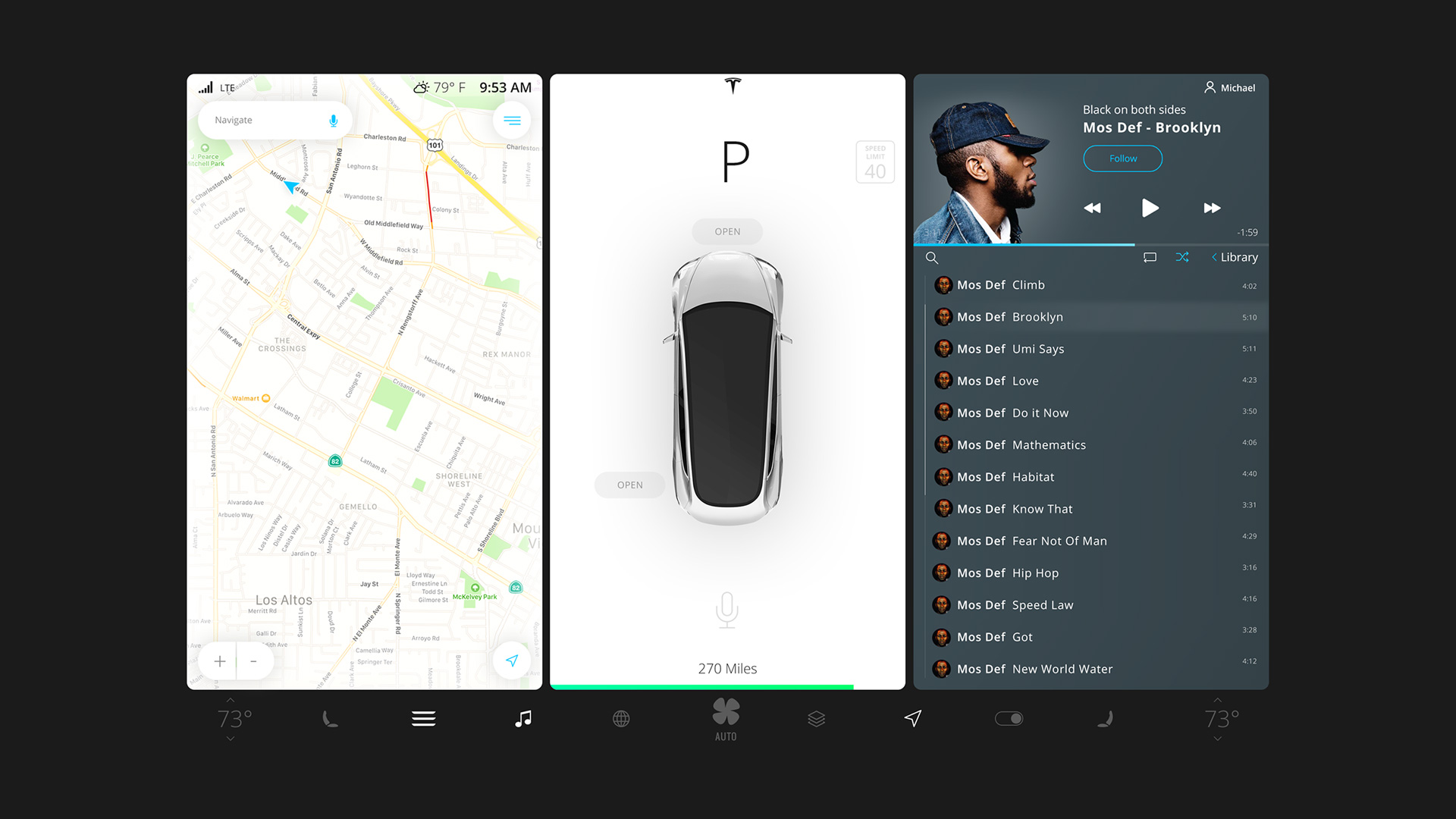
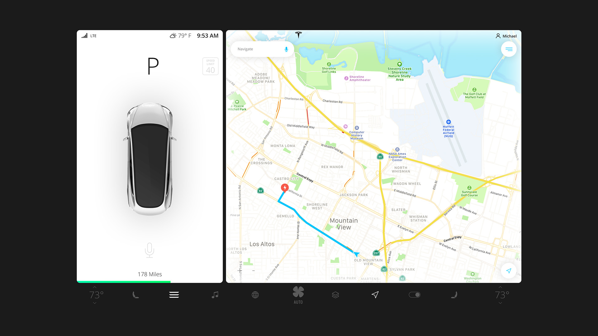
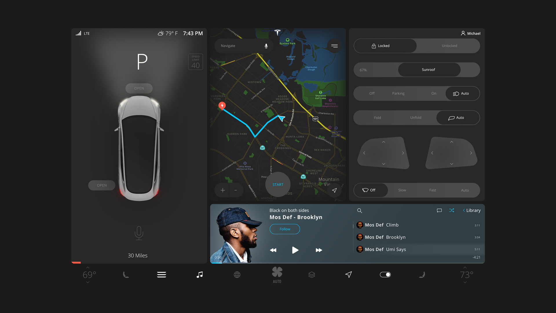
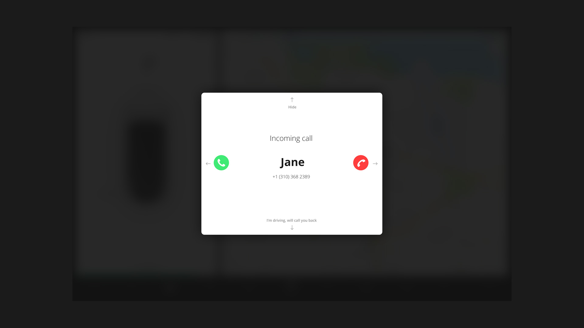
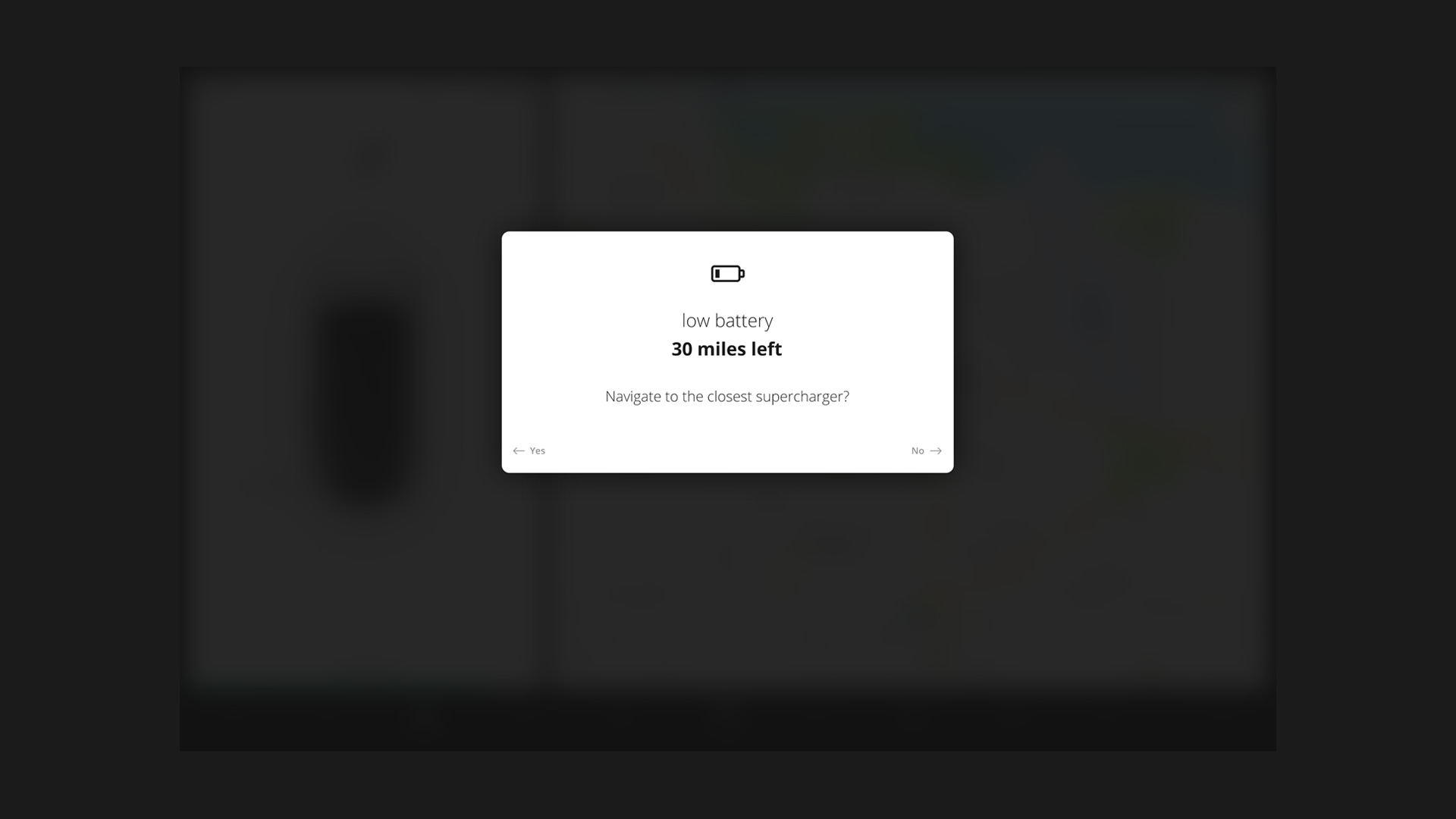
Model 3 has been released with a new 15-inch touchscreen, which is wider than previous screens on Model’s S and X. Whilst it looks great, some areas of the screen and functionality have become harder to reach. This may seem like a minor difference, however, when operating a vehicle it could become significant, as every moment is crucial. To combat this we came up with an adjustable grid where users can move panels of the dashboard to best fit their needs. For instance, the media player can be moved to the passenger's side so they can enjoy playing DJ, whilst the map can be moved in closer view to the driver and expanded or hidden in case of autonomous driving.
Three-finger
gestures
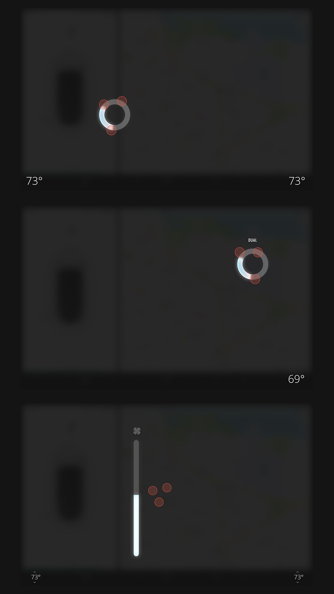
Using three fingertips, drivers or passengers can adjust climate control by rotating left or right. When adjusted from the driver’s side of the screen, the temperature is controlled for the whole vehicle; alternatively, applying the same gestures from the passenger side enables dual climate control.
• Rotation (driver’s side) controls temperature
• Rotation (passenger's side) dual climate control
• Scroll top and bottom to adjust fan level
Two-finger
gestures
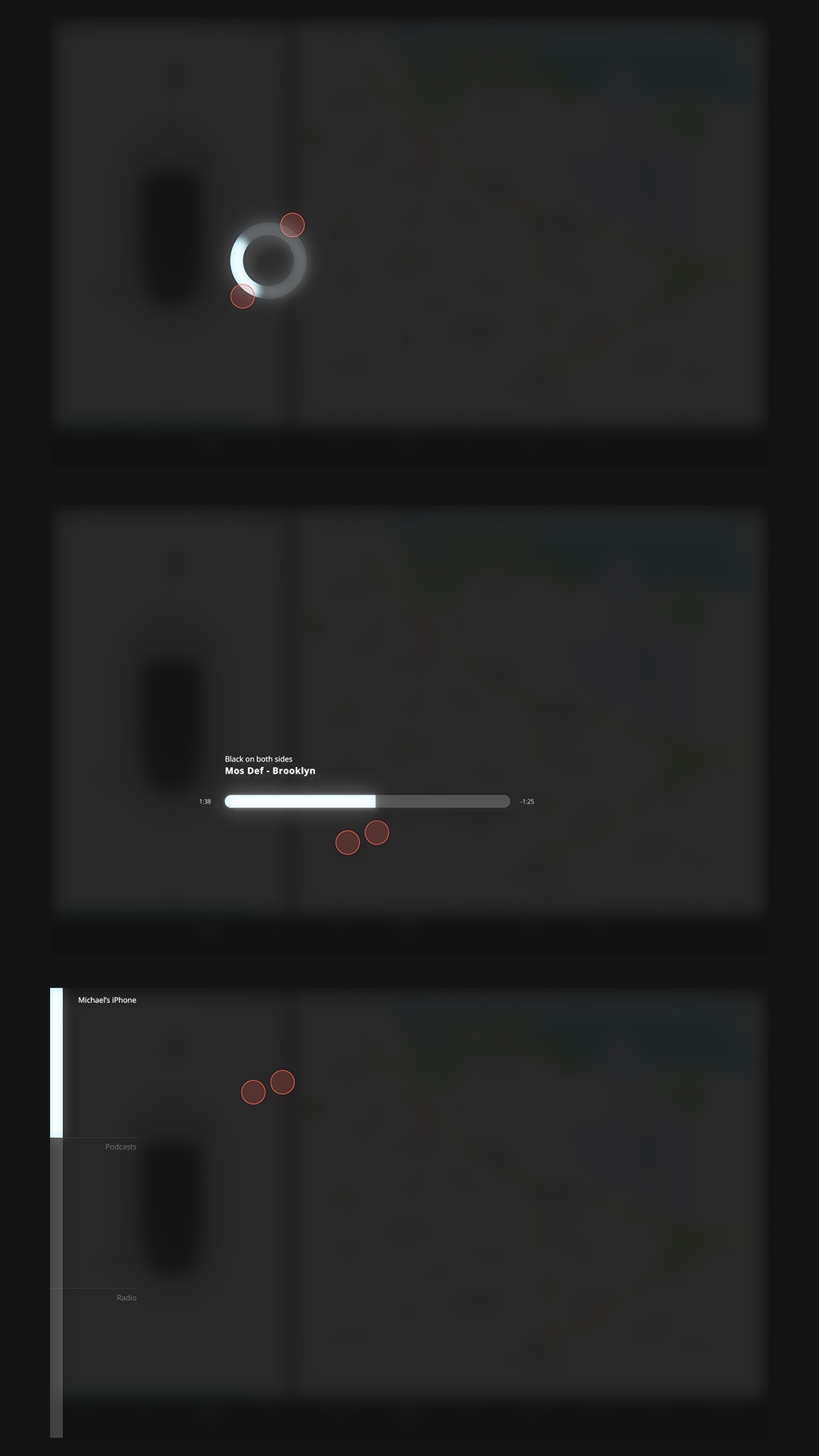
Using two fingertips, drivers or passengers can control the multimedia player, even when it’s not displayed on the screen. Each gesture has been designed to replicate the physical buttons and dials we’ve become accustomed to, for example, the volume wheel rotation.
• Tap to play and pause
• Rotation brings up the volume
• Tap and scroll sideways to fast-forward
• Quick scroll sideways to change media
• Scroll top and bottom to change channels
*All product names, logos, and brands are property of their respective owners. All names used in this project are for identification purposes only.
Multi-touch gestures can be applied to any area of the screen, and don’t require a driver to be distracted by looking away from the road to find the right button. These gestures would be intuitive and replicate physical buttons so we don't have to memorize them.
Michael Cherkashin Creative directorLet’s create
something amazing

We used a simple and smooth design, with a very friendly and warm feel. The buttons are large, with plenty of surrounding space so it’s easy to tap while driving. The colors are balanced to be clearly visible in bright sun and soft enough to be non-distracting for the driver.
Michael Cherkashin Creative director