3 essentials for ultimate
UI/UX design.
insights | 8 January 2021
Let’s talk UI/UX. There are three foundations of ultimate user experience design, and each is essential for every product designer to understand. Combining all three is not an easy task; that’s why there’s very few really great, easy to use products out there.
EFFICIENCY
Efficiency is the ability to avoid wasting stuff – in our case, time and effort. In other words, a user should be able to perform the desired action as quickly and effortlessly as possible. However, with the current technologies, absolute efficiency is not possible. Services like Neuralink are still being developed, and (let’s be honest) it creeps out the majority of people. So in the meantime, our job as product designers is making the user experience as efficient as possible with our limited resources like touch screens, cursors and in rare cases, voice commands.
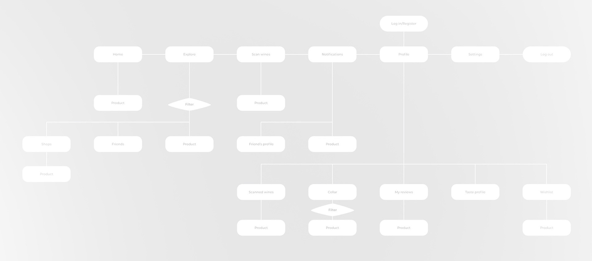
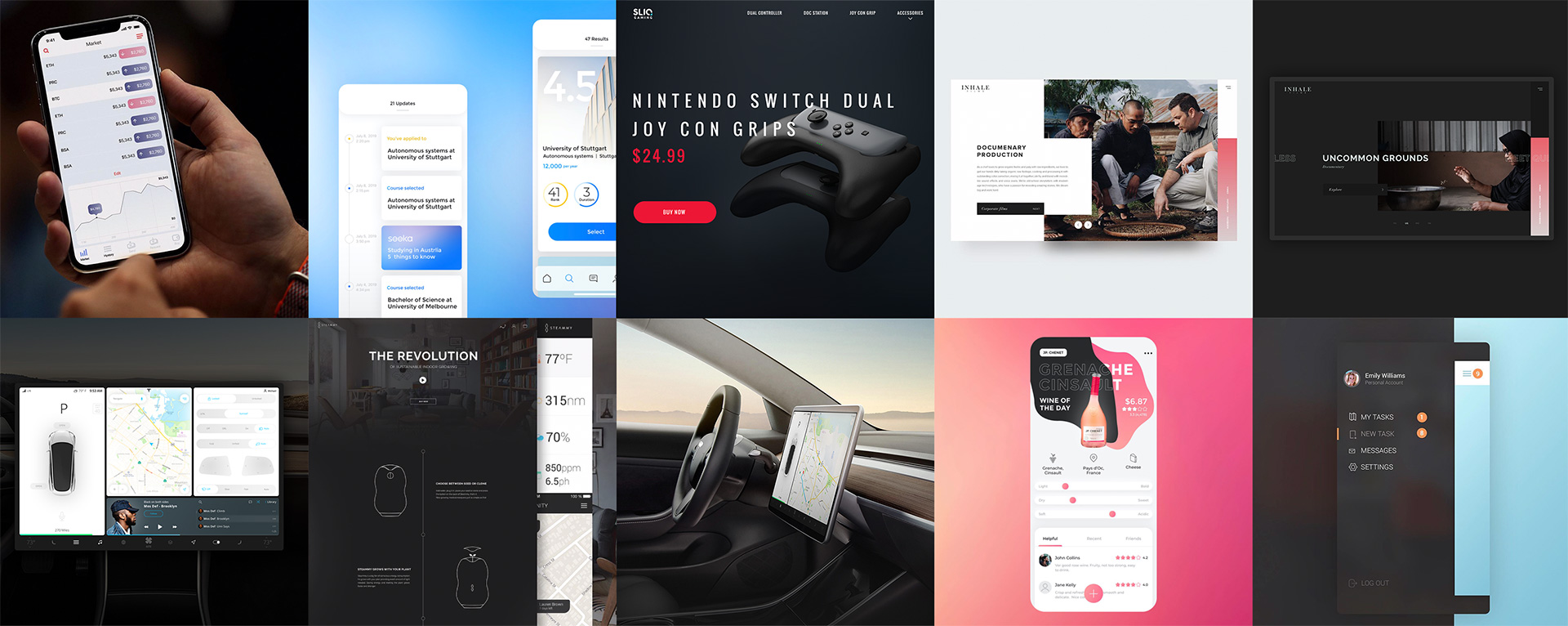
Let’s start with the fundamentals – the structure and layout. This is the blueprint of any digital product. If we create a structure and layout that are easy to understand and navigate, the user will spend less time figuring it out, less time per task – higher efficiency. Some people might be wondering why, with such advanced web technologies, all sites look pretty much the same – logo on the left, nav menu on the right, large title with CTA button, etc. The answer is because it’s more efficient when a user lands on the website (or app) and understands where to go to find the desired information or perform a task. If every product had a unique layout, it would be a lot harder to understand how to navigate, AKA low efficiency. Although we’re not advocating for the same boring design for every product, we encourage designers to deliberately design products while keeping in mind the standards that have formed over time.
Another important topic is a mindful approach to elements placement on the screen. The classic example is the back button on iOS. The legacy iPhones were a lot smaller in size, so you could easily reach the top corner with your thumb; however, iPhones are getting bigger and bigger, and therefore the back button is harder and harder to reach. With the launch of iPhone 6, Apple introduced double-tapping the home button to lower all elements on the screen so the back button and other elements are easier to reach. Think about it: you have to tap the home button twice, then try to reach to the far left corner just to perform one simple action. A dubiously efficient decision. Luckily, we can implement swipe right gestures in our UX designs.
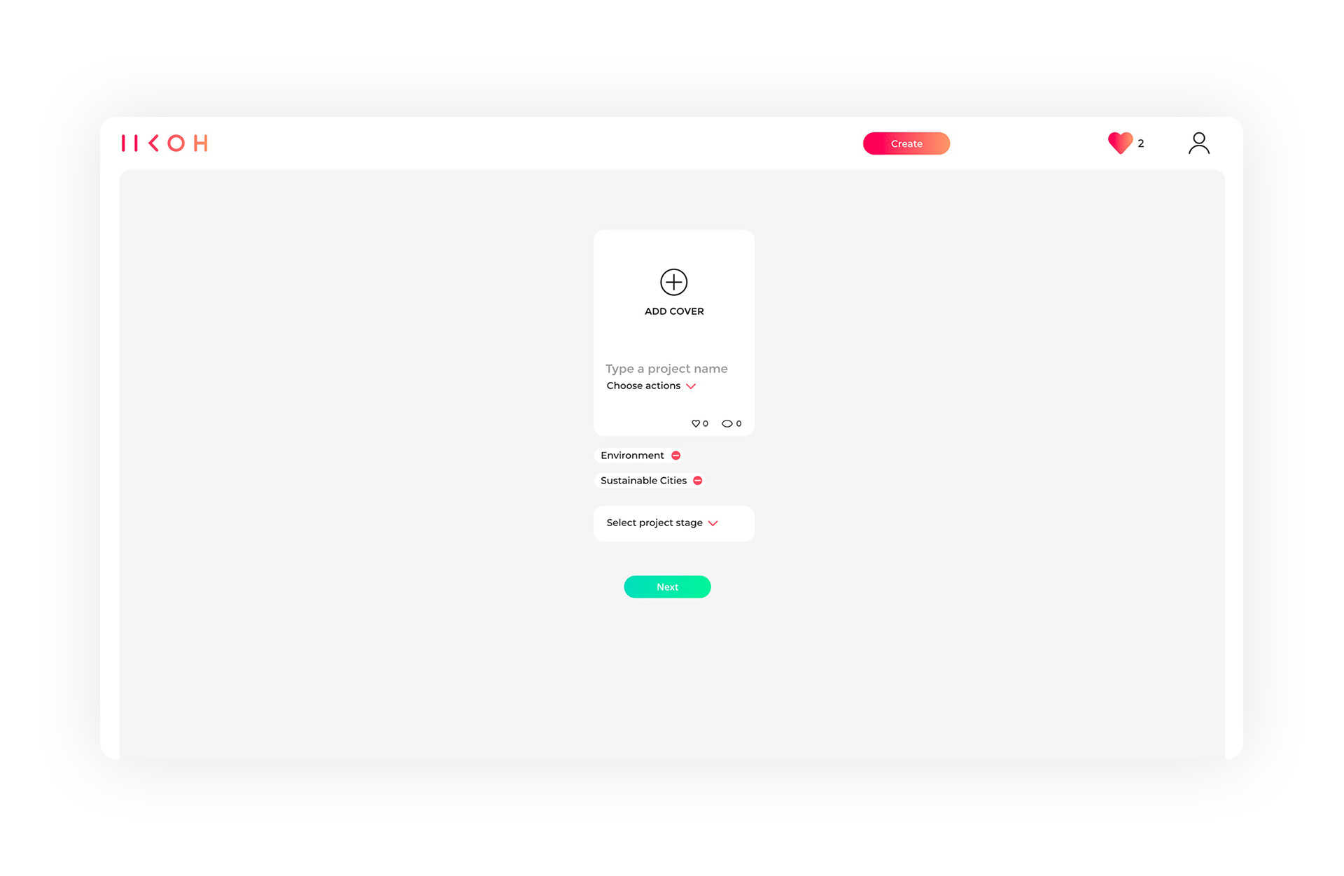
Another classic example is all sorts of drop-downs, sliding panels and menus. Let’s say we expand a nav menu by clicking on the burger button. The obvious way to place the closure button would be in the same place so we can click or tap with ease, but there are designers who place the closing button on the opposite side of the screen or at the bottom of the panel so users have to locate the button and then move the cursor or their finger to perform an action. At Hug Agency, we research user patterns to prevent such annoying interactions and we encourage all designers to choose wisely regarding where to place UI elements.
One more tactic to help with efficiency is visual hierarchy. Think about it like the ranking system for the UI elements. The main tools here are size, color, viewing patterns and air (free space). Learning how to use them properly is definitely worth the effort. One example would be using colors. With the rise of clean and minimal design, it’s so tempting to use one branded color for everything – let’s say a blue logo, blue titles and blue buttons. But if all buttons are the same color, it’s difficult to emphasize one important action like save, record or just marketing CTA. Being efficient with the visual hierarchy is key for successful UI/UX design.
EXCITEMENT
Excitement is an extremely important element of both interface and UX design. If you have a product that is highly efficient but lacks character or enjoyment and doesn’t make you excited, it’s just boring – and let’s be honest, who wants to use boring products? Although both efficiency and excitement are pretty straightforward on their own, the balance between the two is where the majority of designers struggle. It’s so easy to overdo. Modern tech offers many cool things like animations, visual effects, 3D, smooth scroll and the list goes on. The so-called “wow effect” is great to entertain users and make the product more emotional and easier to remember, but it’s also so tempting to overdo, as any digital design agency wants to showcase their full range of capabilities. The trick is to excite the user, but not at the expense of efficiency.
The core idea is to communicate a certain message or amplify the experience. Ever noticed a rubber effect on your phone? When you scroll to the very bottom (or top) of the list, it sort of bounces back. The idea of this feature is to tell you that this is the end of the list, and you can’t scroll further. This is a great example of how visual effects can be not only fun but also informative.
ETHOS
Ethos means character. In our case, it’s a visual representation of the brand’s values, ideology, and positioning. What do you stand for? What message do you want to share with the world? It all translates to a user interface with visual language – colors, shapes, usage of space, interaction, etc. It all evokes certain emotions. As designers, we have to be very mindful of what emotions we want people to experience while using the product.
Another important role of ethos is recognition. Creating harmony across all the brand’s touchpoints makes the product more recognizable; this benefits both the company and the end-user.
If we design a product for young moms to help with their babies’ routine, for example, and the main company value is “care-giving,” we would probably want to implement rounded corners, soft shapes, pastel gradients, bobbly patterns and things like that instead of bright, bold, and aggressive design. Of course, it’s a primitive example, but the idea is very important. We should think not only about how functional and cool our UX design is, but also how well it integrates into the overall brand strategy.
We hope this “three E” approach will help you understand our process a little more, if you’re looking for a digital design agency to help with UI/UX design feel free to schedule a free consultation or if you’re a designer like us we hope you can implement our strategies in your workflows for ultimate product design.
About author
Hug is a branding and digital agency specializing in brand development and offering a mindful approach to UI/UX design. We love companies that innovate and produce with care for the environment and believe that brands influence the world around.


Next
Value-Based
logo design principles
Developed at HUG Value-Based logo design principles is a part of the branding strategy that we use to create meaningful brands.
ExploreDon't miss
upcoming stories
Subscribe
Let’s create
something amazing